Huimbor: A Vintage Serif Display Font That Elevates Digital Branding
It started with a hero section. I was refreshing the homepage for a small independent coaching practice—clean layout, warm photography, intentional whitespace—and the headline felt flat. The current sans serif worked fine for body copy, but it didn’t carry the quiet confidence and thoughtful elegance the brand stood for. So I pulled up Huimbor.
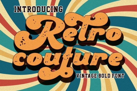
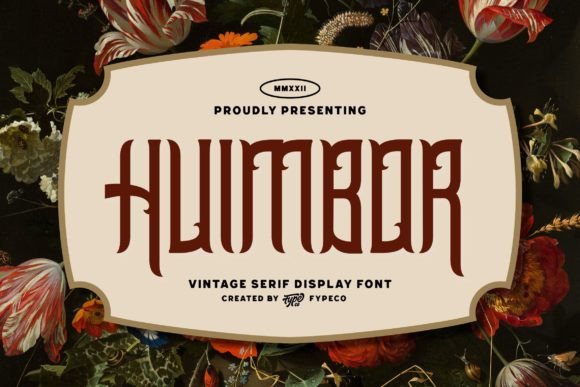
Huimbor is a vintage serif display font inspired by Victorian typography—but not a strict revival. Its modified ornaments, subtle flourishes, and balanced proportions give it character without clutter. It’s refined, not fussy; distinctive, not distracting. In that first preview over a soft cream background, the headline immediately gained presence—not loudness, but weight. A kind of visual gravitas that invites pause, not skimming.
I tested it across real scenarios: a course sales page header, a boutique online store’s seasonal banner, and a portfolio site’s “About” section title. In each case, Huimbor performed best where impact matters most—hero headlines, section dividers, and short branded phrases like “Your First Session” or “New Collection.” It’s not meant for paragraphs or mobile navigation labels. It’s a deliberate accent, like a well-placed texture in UI design.
Readability on screen is excellent *when used intentionally*. At 48px+ on desktop, its open counters and generous x-height keep letters legible even with delicate serifs. On mobile? I scaled it to 36px with tighter tracking and added 2px letter-spacing—just enough to preserve clarity without sacrificing charm. Over image overlays, I always paired it with a subtle text shadow (1px black at 30% opacity) or a semi-transparent background bar. Never placed it directly over busy textures without contrast support.
One thing I appreciated: Huimbor includes true italics—not just slanted roman—and a full set of OpenType alternates. That meant swapping in a more ornate ampersand for a “Handcrafted & Honest” tagline, or choosing a cleaner swash for a logo lockup. No guesswork. Just design control.
Font pairing was intuitive. For body copy, I defaulted to a neutral, highly legible sans serif—think Inter, Poppins, or even system fonts like -apple-system—with generous line height and comfortable measure. The contrast between Huimbor’s expressive serifs and the calm rhythm of the sans created instant hierarchy. No need for bold weights or extra spacing to signal importance—the typefaces did that work together.
I also checked what came in the package before committing: web-optimized WOFF2 files, full Latin character support (including accented characters for bilingual client sites), and clear commercial licensing. No surprises when exporting assets for Figma handoff or uploading to Webflow. And crucially—no variable axis to manage. Huimbor is a focused tool, not a framework. That simplicity saved time during QA.
Where Huimbor shines most is in digital spaces that benefit from editorial warmth: a newsletter banner, a blog post title, a campaign landing page headline (“Spring Studio Hours Are Open”), or a digital brand kit cover slide. It adds sophistication without pretension—like using linen texture in a UI component, but with type.
It’s less effective in fast-scanning contexts: button labels under 16px, dense product grids, or multi-line testimonials. I tried it in a CTA button once—“Begin Your Journey”—and while it looked beautiful at rest, it lost clarity on hover states and felt visually heavy next to iconography. Better reserved for the headline above the button, not the action itself.
For dark mode, I adjusted carefully. Huimbor’s thin strokes hold up well against charcoal or deep navy backgrounds—but only when the weight is consistent and contrast is high. I avoided light or thin variants entirely in dark UIs. Instead, I stuck with the regular weight and increased contrast via background tone rather than font weight. Always tested on both OLED and LCD screens to confirm edge definition.
What surprised me was how well it translated to social media graphics exported from Figma. Because Huimbor renders crisply at high resolution and includes robust hinting, even small Instagram story headers (at 28px) retained their personality. No pixelation, no awkward gaps between letters. That consistency across web and social assets made it feel like part of a unified design language—not just a one-off decorative choice.
Of course, I double-checked licensing before adding it to the live site. Huimbor is a commercial font, and the license explicitly covers web embedding, SaaS interfaces, and client projects—as long as it’s not redistributed or served from a third-party CDN without permission. A quick read of the EULA saved me from last-minute font swaps during deployment.
In the end, Huimbor didn’t just “look nice.” It helped clarify voice. The coaching site went from feeling generic to feeling *considered*—like every detail, including type, had been weighed for meaning. That’s the quiet power of a well-chosen display font: it doesn’t shout the brand message. It makes space for it to land.
If you’re building a portfolio, launching a course, refining a boutique shop, or designing a campaign page where tone matters as much as function—Huimbor is worth testing early. Not as background noise, but as intentional punctuation. A serif display font that remembers it’s living on screens—and designs accordingly.